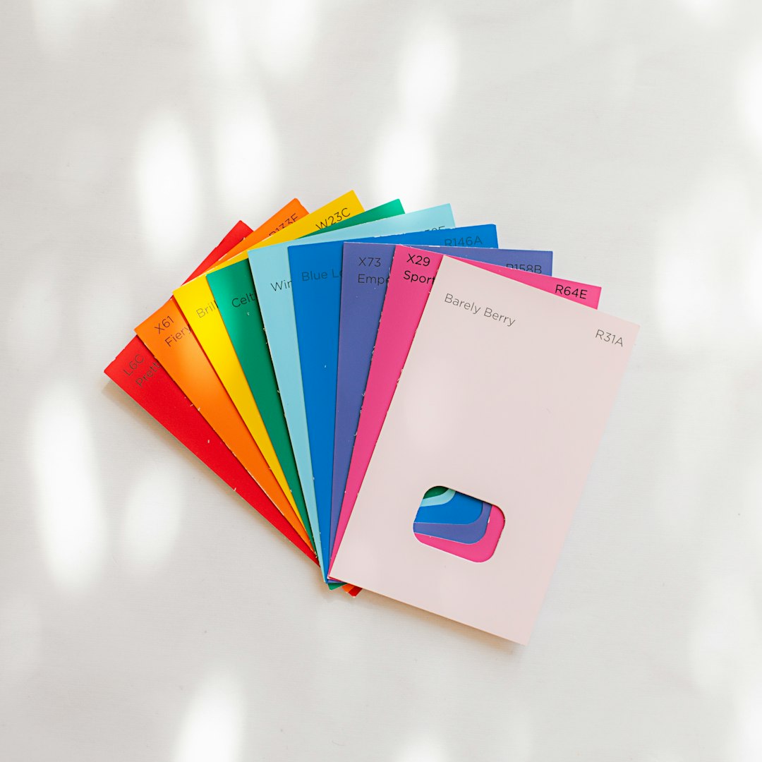
Choosing the right colors for your logo is a big deal. It’s not just about what looks pretty on a screen. It’s also about what prints well—on business cards, T-shirts, banners, and every other surface your brand touches.
TL;DR: Some color combinations look fantastic on screen but turn into a mess when printed. The trick is to use colors with high contrast and good visibility. Avoid complex gradients and neon shades. Below are 15 tried-and-true logo color combos that always print great—and look awesome too!
1. Black and White
Classic, powerful, simple. This combo works on any background, and it never goes out of style. It prints well on everything, from letterhead to merchandise.
2. Navy Blue and White
This is a popular duo for corporate designs. Navy adds a professional flair, and the white makes sure everything stays crisp and legible.
3. Red and Black
Striking, bold, and unforgettable. Red brings energy, and black keeps it grounded. This high-contrast combo looks great in solid print styles.
4. Dark Green and Gold
Want a logo that whispers class and tradition? Go with dark green and gold. These two print beautifully, especially on textured paper or embossed finishes.
5. Royal Blue and Silver
Cool and sophisticated. Royal blue and silver bring a high-quality feel. Silver metallics can look amazing in print with proper finishes.
6. Maroon and Cream
This combo balances warm and neutral tones. Maroon gives depth, while cream softens the overall look. They work especially well on textured print materials.
7. Black and Yellow
This duo screams visibility. Think caution signs and sports teams. Black creates the base, and yellow pops off the page like nobody’s business.
8. Charcoal Gray and Orange
Looking for a modern edge? Charcoal gray feels sleek, while orange adds a spark. Together, they make any brand look trendy and energetic.
9. Turquoise and White
Light, refreshing, and vibrant. Turquoise carries personality, and white helps it breathe. Plus, it prints well even in bulk runs.
10. Purple and Gold
A regal color combo if there ever was one. Purple adds richness, and gold gives shine. Often used for luxury brands and boutique businesses.
11. Forest Green and Beige
Earthy and calming. These colors look super natural together and print well across organic materials. Great for eco-focused brands.
12. Blue and Orange
Opposites attract! Blue is calming, orange is exciting. Together they bring balance and stand out without being loud.
13. Navy Blue and Gold
This color duo is timeless. Navy keeps it professional, and gold says, “I mean business—with finesse.” Works brilliantly on high-end print materials.
14. Black and Red-Orange
This pairing is high energy. Red-orange is more vibrant than standard red, and when paired with black, it commands attention in print.
15. Teal and Coral
Want something playful but still polished? Teal and coral are lovely together. They’re bold, trendy, and surprisingly print-friendly.
Tips for Printing Logo Colors Successfully
Color combos are only one piece of the print puzzle. Here are some quick tips to make sure your logo turns out perfect in print:
- Use CMYK color mode: Your design might look different in RGB on screen. Always convert your files to CMYK for the best print results.
- Avoid too many gradients: Subtle shading can get lost in the printing process, especially on smaller logos.
- Test print small samples: What looks great on a screen might not work on paper. Print before you commit to a big batch.
- Consider the background: High contrast helps logo text and icons stand out across surfaces.
- Go for solid tones: Solid blocks of color print more cleanly and are easier to manage.
Why Some Color Combos Don’t Print Well
Ever design a logo that looked amazing on your computer but disaster in your hands? You’re not alone. Here’s why that happens:
- Neon and light colors can wash out: These may look bright on a screen, but printers often can’t hit that same pop.
- Too little contrast: Light gray on light blue? It may vanish once printed.
- Wrong color mode used: If you leave a file in RGB, it can mess up the colors when printed.
Quick Recap
When in doubt, keep things simple. Use contrast. Go for bold. Avoid overly detailed color effects that might not survive printing.
These 15 logo color combinations are perfect for businesses who want great results on screen and in printed form. So the next time you’re picking your palette, let it be one that shines in every setting—digital or physical!
Happy designing (and printing)!