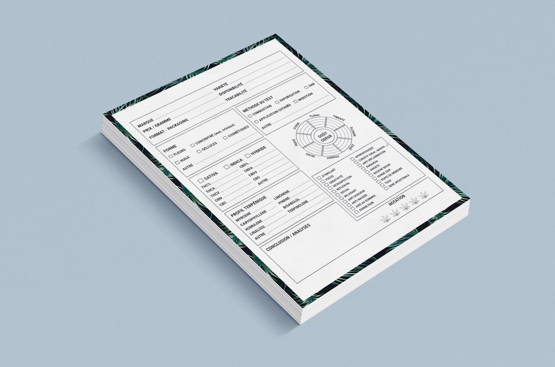
Build the PDF structure first, then add form fields, buttons, links, and page controls in a controlled order. That is the safest way to create an interactive PDF that works for real users, not just on your own laptop.
TLDR: Start with a clean source document, export it as a PDF, then use a proper PDF editor to add fields, links, buttons, bookmarks, and page controls. For example, a small HR team can turn a 6-page onboarding packet into a fillable PDF and cut email back-and-forth by 40% if required fields and submit buttons are set correctly. Test the final file in Adobe Acrobat Reader, a browser viewer, and on mobile before sending it out. Most errors come from rushed field names, broken links, and poor tab order.
1. Start With the Right Source File
An interactive PDF is only as good as the document beneath it. Create the layout in a tool that gives you control over spacing, headings, tables, and page flow. Microsoft Word, Google Docs, Adobe InDesign, Affinity Publisher, and LibreOffice can all work, depending on the job.
Keep the design clean. Leave enough room for text fields. Do not place form labels too close to borders. Use clear section headings. If users have to guess what a field means, the form has already failed.
Before exporting, check these basics:
- Use readable fonts, preferably 10 pt or larger for body text.
- Keep labels close to fields, but not cramped.
- Use consistent margins across all pages.
- Add page numbers if the file has more than two pages.
- Write clear instructions at the start of each section.
Export the file as a PDF with accessibility tags if your software allows it. Tags help screen readers read the document in the correct order. They also make later editing less painful.
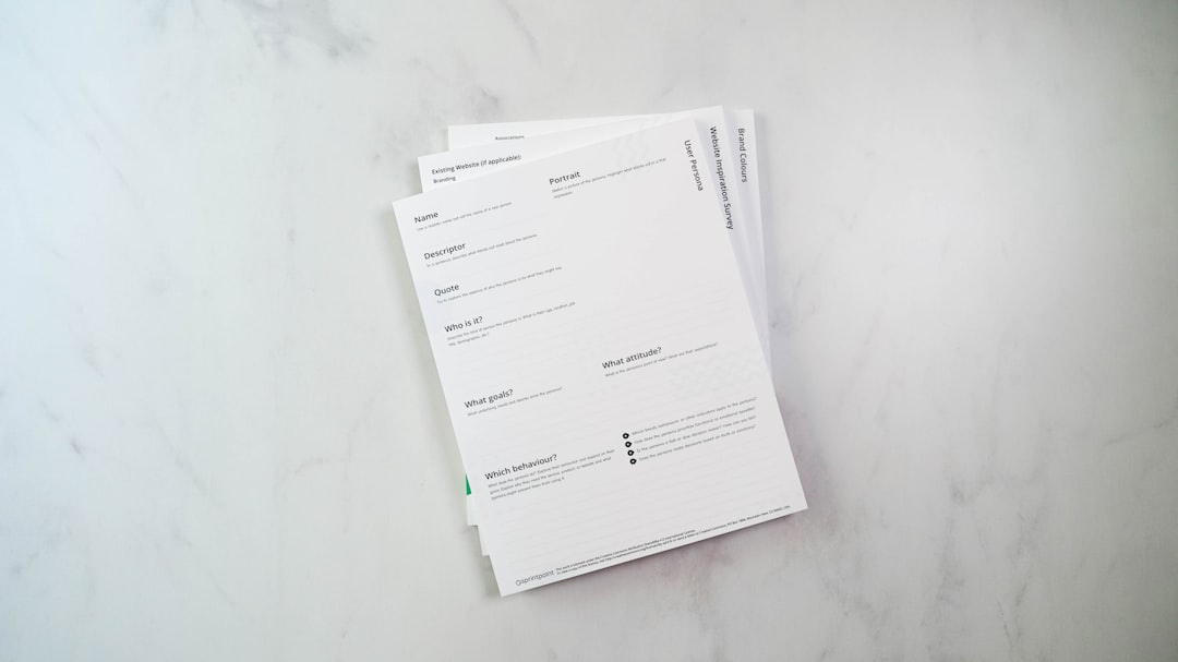
2. Choose a PDF Editor That Supports Interactive Features
You need more than a basic PDF viewer. Use software that can create and edit form fields, actions, links, bookmarks, and JavaScript if needed. Adobe Acrobat Pro is the common business standard. Foxit PDF Editor, PDF-XChange Editor, Nitro PDF Pro, and Master PDF Editor are also used in many workplaces.
Free tools can handle simple edits, but they often fall short with advanced forms. The catch is that browser-based PDF tools may display a form correctly, then save it badly. That can flatten buttons, break calculations, or strip field settings.
For serious work, pick a tool that supports:
- Text fields for names, addresses, notes, and IDs.
- Checkboxes for yes or no choices.
- Radio buttons for one-choice-only questions.
- Dropdown lists for controlled answers.
- Digital signature fields when approval is needed.
- Buttons for submit, reset, print, save, or jump actions.
- Links and bookmarks for fast movement through the file.
3. Add Form Fields Carefully
Open the PDF in your editor and switch to Prepare Form or the equivalent form-editing mode. Many editors detect blank lines and boxes automatically. Use auto-detection as a starting point, not as final work. It often creates fields in the wrong places or gives them vague names like “Text1” and “Text2.”
Rename every field with a clear pattern. Use names such as employee_name, start_date, or manager_email. A naming plan matters because duplicate field names can cause two boxes to share the same value. It drives me crazy that this mistake can hide until the last review, when one typed address suddenly appears in three places.
Set field properties while you work:
- Required: Use this for essential fields only.
- Format: Apply date, number, currency, or percentage rules where needed.
- Character limit: Use it for IDs, phone numbers, and short codes.
- Default value: Add one only when it reduces user effort.
- Tooltip: Write a short help note for screen readers and confused users.
For longer forms, set the tab order manually. Users should move through the form in a logical sequence when they press the Tab key. A bad tab order makes the file feel broken, even if every field technically works.
4. Create Useful Buttons
Buttons can save time, but only if they are predictable. Common PDF buttons include Submit, Reset, Print, Save, and Go to Page. Place them where users expect them, usually at the end of a section or at the bottom of the final page.
Set each button action with care. A submit button can send data to an email address or web server, depending on your workflow. Email submission may sound simple, but it depends on the user’s email client and security settings. For reliable collection, a web form or document management system is usually better.
Use reset buttons sparingly. If someone clicks one by accident after filling out nine pages, they will not thank you. If you include a reset button, label it clearly as Clear Form and consider adding a confirmation action if your PDF editor supports it.
5. Add Links to Pages, Websites, and Email
Links are simple, but they deserve careful checking. Add links to external resources, internal sections, policy pages, help pages, and email contacts. Make link text descriptive. Avoid vague text such as “click here.” Use wording like Read the expense policy or Email the benefits team.
Internal links are useful in long PDFs. A table of contents can link directly to sections. A “Back to top” link can help in reference guides, catalogs, manuals, and legal packets. Make sure internal links point to the correct page after final edits. Page shifts can ruin links if they were added too early.
For web links, include the full URL in the link settings. Test each one. Do not assume copied links are clean. Hidden tracking codes, expired pages, and login-only pages can all create trouble for users.
6. Use Bookmarks and Page Controls
Bookmarks give structure to longer PDFs. They appear in the side panel of most professional PDF readers and help users reach sections quickly. Create bookmarks for major headings, appendices, forms, pricing tables, instruction pages, and signature pages.
Keep bookmark names short. A bookmark called Step 3: Employee Tax Information is better than a full sentence. Nest bookmarks only when the file is long enough to need it. Too many levels can feel messy.
You can also add page buttons for common actions. For example, a training workbook might include buttons for Previous Page, Next Page, Return to Menu, and Start Quiz. These controls are useful for guided documents, sales decks, learning materials, and client packets.
7. Check Accessibility Before Release
Accessible PDFs are easier for everyone to use. They are also required in many public sector, education, healthcare, and enterprise settings. At minimum, check reading order, tags, color contrast, field labels, and keyboard access.
Every form field should have a meaningful tooltip or label. Screen reader users need to know what each field asks for. Buttons also need clear names. A button announced as “Button 12” is not acceptable in a professional file.
Run the accessibility checker in your PDF editor. Then test manually. Automated checks miss context. They may not know that a field label is unclear or that a reading sequence feels strange.
8. Test the PDF Like a User Would
Testing is where most weak PDFs reveal themselves. Open the file in Adobe Acrobat Reader, Chrome, Edge, and at least one mobile device. Some browser viewers do not support every form feature. Mobile apps may treat signatures, calculations, and buttons differently.
Use this quick test plan:
- Fill every required field.
- Leave one required field blank and check the warning.
- Use the Tab key from start to finish.
- Click every button.
- Open every link.
- Test bookmarks and page controls.
- Save, close, reopen, and confirm the data remains.
- Print the file and check field visibility.

9. Secure and Distribute the Final File
Apply security only when needed. Password protection, editing restrictions, and signature certificates can protect sensitive files, but they can also block users from completing the form. Use the lightest control that meets the risk.
If the PDF contains personal data, treat distribution seriously. Send it through approved channels. Avoid asking users to email sensitive files unless your organization has accepted that risk. For high-volume workflows, connect the PDF to a secure upload portal or case management system.
Keep a master copy with editable fields. Save a separate release copy for users. Add a version number and date in the footer, such as Version 1.2, March 2026. That small habit prevents confusion when old files keep circulating.
Final Checklist
- Clean layout: The form is readable and not crowded.
- Clear field names: No random or duplicate names.
- Logical tab order: Keyboard users can move smoothly.
- Working buttons: Submit, print, reset, and page actions behave correctly.
- Verified links: Internal and external links open the right place.
- Useful bookmarks: Long documents have a clear structure.
- Accessibility checked: Labels, tags, and reading order are usable.
- Cross-platform tested: The file works in readers, browsers, and on mobile.
A good interactive PDF should feel boring in the best way. Users open it, fill it in, click what they need, and send it back without asking for help. That takes planning, testing, and restraint. Skip those steps, and expect support emails within minutes.