Email design is a balancing act: you want your message to look polished, load quickly, display correctly across devices, and guide readers toward a clear action. Dimensions play a bigger role in that than many marketers realize. From the width of the email body to the size of a hero image, every pixel can influence readability, click-through rates, and the overall user experience.
TLDR: The safest standard email width is typically 600 pixels, while mobile-friendly designs should scale smoothly down to about 320 pixels. Keep hero images bold but lightweight, buttons large enough to tap, and total email file size as lean as possible. For most campaigns, responsive layouts, compressed images, and clear spacing will matter more than filling every available pixel.
Why Email Dimensions Matter
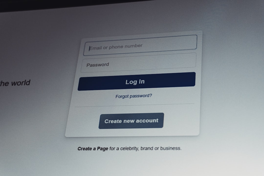
Email is not viewed in one neat, predictable environment. Your campaign may be opened in Gmail on a laptop, Apple Mail on an iPhone, Outlook on a desktop, or a tablet browser. Each platform handles spacing, images, fonts, and scaling a little differently. That is why dimension choices should be based on compatibility, not just aesthetics.
Good email dimensions help your campaign:
- Load faster, especially on mobile networks.
- Look consistent across major email clients.
- Improve readability without requiring zooming or horizontal scrolling.
- Support stronger calls to action with better visual hierarchy.
- Reduce clipping issues, especially in Gmail and mobile inboxes.
The Ideal Email Width
For most marketing campaigns, the recommended email width is 600 pixels. This has long been the industry standard because it fits comfortably within most desktop email preview panes while still scaling well on mobile devices.
A typical layout might use a container that is 600 pixels wide, with inner padding of 20 to 30 pixels. That leaves around 540 to 560 pixels for text, images, and buttons, which is enough space to create a polished design without overwhelming the reader.
Some modern campaigns use widths of 640 pixels or even 700 pixels, especially for visual newsletters or editorial-style emails. However, wider layouts can be less predictable in older clients and may feel cramped on smaller screens if they are not responsive. If you are unsure, stay with 600 pixels.
Recommended Email Height
Unlike width, email height is flexible. There is no single perfect height because emails can scroll indefinitely. However, that does not mean you should make them endlessly long. The most important content should appear within the first 300 to 500 pixels, often called the above-the-fold area.
This top section should usually include:
- Your logo or brand identifier.
- A strong headline or offer.
- A supporting image or short message.
- A visible call-to-action button.
For promotional campaigns, a total email height between 1,500 and 2,500 pixels is often enough. Newsletters may be longer, particularly if they include several articles or product sections. Still, every section should earn its place. If readers must scroll too far before understanding the value, engagement may drop.
Header Dimensions
The header is usually the first branded element readers see. A common email header size is 600 pixels wide by 70 to 200 pixels tall. The exact height depends on whether the header contains only a logo or also includes navigation links, a banner, or a short announcement.
If your header contains a logo, keep it crisp and properly scaled. A logo that is too large can push important content downward, while one that is too small may reduce brand recognition. A practical logo size is often around 120 to 200 pixels wide, depending on its shape.
For mobile users, avoid crowded navigation menus in the header. Three or four links may work on desktop, but they can become tiny and difficult to tap on a phone. In many campaigns, a logo and one clear message are more effective than a complete menu bar.
Hero Image Size
The hero image is the main visual near the top of your email. It sets the tone and often supports the primary campaign message. For a standard 600-pixel-wide email, a hero image is commonly 600 pixels wide and between 300 and 450 pixels tall.
If you want a more dramatic visual, you can use a taller hero image, but be careful. Oversized images may slow load times and push your call to action too far down the email. A strong hero section usually combines an image, a concise headline, and a button without requiring readers to scroll excessively.
Always compress hero images before uploading them. As a general rule, try to keep individual images under 200 KB when possible. Use JPEG for photography, PNG for graphics requiring transparency, and GIF sparingly for simple animation.

Image Dimensions for Product and Content Blocks
Product images, article thumbnails, and feature graphics should be sized consistently. In a single-column email, images often span the full content width, around 540 to 600 pixels. In a two-column layout, each image may be around 260 to 280 pixels wide, depending on spacing.
For ecommerce campaigns, square product images such as 600 by 600 pixels or 400 by 400 pixels work well because they are easy to crop and align. For blog newsletters, rectangular thumbnails such as 300 by 180 pixels can create a clean editorial look.
Remember to include descriptive alt text for every meaningful image. If images are blocked by an email client, alt text helps readers understand what should be there and can preserve the purpose of the campaign.
Button Size and Spacing
Buttons must be easy to see and easy to tap. A good minimum button height is 44 pixels, which aligns with common mobile usability guidance. Width can vary, but many email buttons fall between 160 and 260 pixels.
Use enough padding around the button so it does not feel cramped. For example, a button with 14 to 18 pixels of vertical padding and 24 to 32 pixels of horizontal padding usually feels comfortable. The surrounding whitespace matters too. A call-to-action button should not be squeezed between dense text and an image.
For best results, use live text buttons styled with HTML and CSS rather than image-only buttons. If an image button fails to load, your main CTA may disappear. A bulletproof HTML button is more reliable across inboxes.
Mobile Email Dimensions
Mobile opens account for a huge share of email engagement, so responsive design is essential. Most mobile screens range from about 320 to 430 pixels wide in CSS display width. Your 600-pixel email should automatically scale down to fit these smaller screens.
On mobile, single-column layouts usually perform best. Two or three columns that look elegant on desktop may become too narrow on a phone. Responsive emails often stack columns vertically, enlarge text slightly, and make buttons full-width or nearly full-width for easier tapping.
Use font sizes that remain readable on small screens. Body text should generally be at least 14 to 16 pixels, while headings often work well between 22 and 32 pixels. Tiny disclaimers may be acceptable in moderation, but do not make essential details hard to read.

File Size and Email Weight
Dimensions are not only about visible width and height. The total weight of your email also matters. If an email is too large, it may load slowly or be clipped. Gmail, for example, may clip messages with HTML code larger than approximately 102 KB. When clipping happens, readers may not see your footer, tracking may be affected, and important content can be hidden behind a “view entire message” link.
To keep email size under control:
- Compress images before adding them.
- Avoid unnecessary code and excessive nested tables.
- Limit the number of custom fonts and heavy design effects.
- Use concise copy and purposeful sections.
- Test your email before sending it to a full list.
Common Campaign Types and Suggested Sizes
Different campaigns have different goals, so their dimensions may vary slightly. Here are practical guidelines:
- Promotional email: 600 pixels wide, 1,500 to 2,000 pixels tall, with a strong hero image and one primary CTA.
- Newsletter: 600 pixels wide, 2,000 to 3,500 pixels tall, organized into clear sections with headings and thumbnails.
- Product launch: 600 to 640 pixels wide, 1,800 to 2,500 pixels tall, with high-quality visuals and feature highlights.
- Event invitation: 600 pixels wide, 1,200 to 2,000 pixels tall, featuring date, location, benefits, and registration button.
- Transactional email: 600 pixels wide, usually under 1,500 pixels tall, focused on clarity, confirmation details, and next steps.
Final Best Practices
The best email dimensions are not just technically correct; they support the message. A compact transactional email should not look like a long magazine newsletter, and a visual product launch should not feel like a plain receipt. Start with the campaign goal, then choose dimensions that make the content easy to understand.
Before sending, preview your campaign on desktop and mobile, check image loading, verify button visibility, and confirm that no key content is clipped. When in doubt, use a 600-pixel responsive layout, keep images optimized, and place the most important message near the top. With the right dimensions, your emails will feel cleaner, faster, and more effective in every inbox.